I've chosen the best for our magazine, these haven't been edited yet so they will be edited before putting into our magazine. We decided to carry out a second photoshoot as we wanted to show a diversity in outfits, locations and positioning. Our second photoshoot we did again in a studio however we changed the make up and clothing, this shows the diversity in fashion and outfit choices. For another idea for a shoot, we decided to go outside for some photos. This would show a diversity in locations and backgrounds. The weather was quite dark and

dreary which was one of the disadvantages of taking photos outside. However it added a grunge effect to the photos which was what we wanted. We also decided to take some photos in the style of INDIE magazine as their front covers really interested us. We used natural lighting and the sunglasses to get the reflection onto them. The photos came out quite well, I like the ones of the models walking as it shows them just in the moment. I like the photos that are simple but also are edgy and fun.
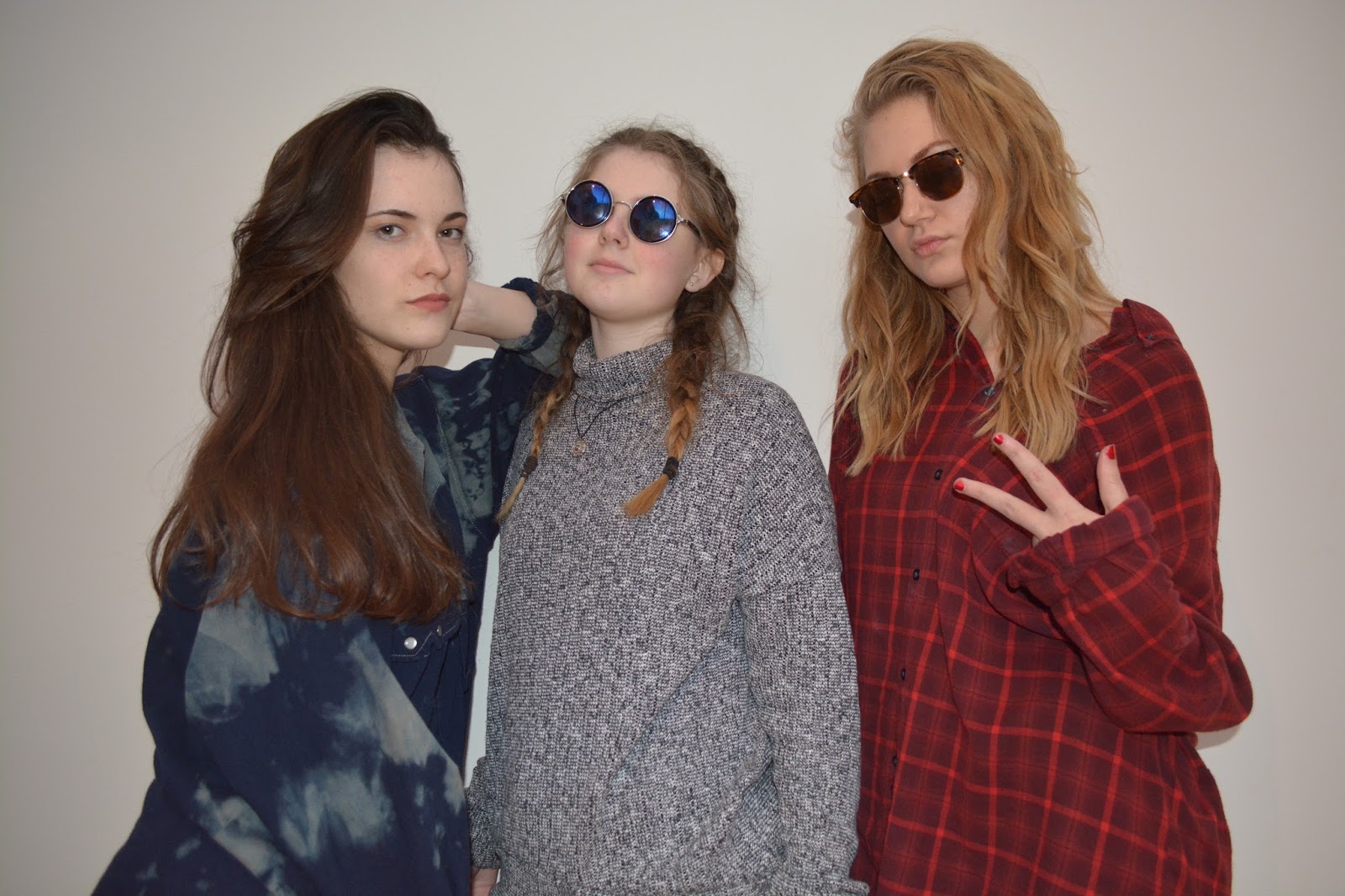
These next images are from the development shoots, whereas the first two images are from our first shoot. We wanted to take some more pictures to use in our magazine for variety. I really like the new images as well as the old ones, and I will be using both in the magazine front page, contents and double-page spread. For the images which were taken outside, when editing I will try to edit the exposure as the lighting is quite bright on the photos. I would like them to be slightly darker.
We will experiment when designing our front covers with different images. I think the images taken in front of a white backdrop will work well as it will look professional. However I think the the image of the single model in the woods would work well as it would stylish and artistic. Either of the images will fit the genre of our magazine therefore will make a decision of which to go with. We will also be using all the images throughout our contents page and double page spread.

I think the top image will fit our genre as it simple and casual. I think when editing this image I will considering changing the saturation to black and white as I think it has a edgy and cool mood to it. This image would work really well for the contents page or a smaller image on the double page spread. The bottom will be really good for our front cover as it interesting and eye-catching. I think the blue composition works really well.


I agree about the weather adding a rough effect to the images. It is very fitting of the genre.
ReplyDeleteHowever, the formatting of this post is not uniform. Can you fix this?
I have uniformed the images to be positioned on the left
ReplyDelete