Saturday 19 March 2016

Evaluation Question 7 Progression

Looking back at your preliminary task, what do you feel you have learnt in the progression from it to your full product?
Preliminary Task (School Magazine Right) and Indie Rock Music Magazine (Left)


I think overall I have made a large improvement within creating a magazine. Throughout my coursework I have expanded my use of other programmes and gained more knowledge on how to edit images and access different ways of presenting my work. During the research period of the project I started to improve my understanding of how the audience and magazine coincide and the relationship between audience and the magazine itself.
The preliminary task does represent its purpose of being a school magazine, shown by the main image and cover lines. However the font for the masthead is too simple and doesn't really stand out. Compared to the final draft of our music magazine, the masthead has improved as it now eye-catching and the reader is drawn in by the bold typography and colours. I think we have successful embodied our genre and audience by choosing this image as the main image as well as the house style of font and the masthead. I think overall the main image for our Indie Rock magazine is better than our preliminary task as it is more eye-catching and will intrigue readers more. I think we have successfully fulfilled the audience and preferences of the social-group. I think we have definitely appealed to our audience by using a young model on the front cover, as majority of our audience was younger. I am happy with the results and how we have improved our magazine cover form the preliminary task. I think elements of our preliminary task have been included in our final product, for example the cover lines layout we have continued to use throughout the process. The final product has a more professional element to it as we have also included a barcode to the bottom left as well as the price and issue number. This overall has added a professional and authentic look to the front cover.
When starting the project with the preliminary tasks, overall I hadn't really worked on programmes such as InDesign, Adobe Bridge and Pages before. Therefore when creating our Preliminary front cover I found it a long and confusing process as I wasn't familiar with the programmes and the tools which we were meant to use in them. Our preliminary task was created on pages, and this was a new programme for us. We learned how to work this programme and then towards the end of the process of our Music Magazine, we were able to create our final front cover easily. As well as other mock ups, we used Pages and InDesign. InDesign was also a new programme to us and we learned how to this programme with ease towards the end of the process.
There were some difficulties we had come across when uploading certain posts to our blogs. For example, at the start of the preliminary task I worked on Microsoft word and Powerpoint. When uploading my work to my blog I found that I wasn't able to upload the work in this format. Therefore I would either upload the post as a full written piece, or I would screenshot the document and upload the work as a picture. This is evident in my older posts. Throughout the process I have be able to vary my work and upload it in different formats. This has also let me show how my skills have developed and I have experimented and learned throughout the process. We also developed by using programmes such as InDesign for our double-page spread and our contents page. We were able to use the tools and programme with greater knowledge.
During the process, we carried out two Photoshoots. This was because after our first Photoshoot, we decided that the images we had taken didn't fit the image we wanted to portray on our front cover. We included images from the first Photoshoot in our magazine, however we decided to carry out another shoot in order to produce better images. The shots from our second shoot then formed the final front cover. This shows we were still learning during our process and learnt how to improve our work and understand how to create an better look for our magazine overall. 
Our research of music magazines helped us create a stylish and eye-catching magazine. During our preliminary task we didn't really research much into school magazines. This came at a disadvantage as we weren't sure what the general conventions of a school magazine. However we did slight research towards the end of the preliminary task and then we were able to apply our research to the final product. Therefore we aimed to improve this during the Music Magazine task. We spent a long time during the research process and we wanted to create a magazine which would appeal to our audience. We made sure to scope out our audience and what were their interests, we would use this information to apply it to our magazine. Also being fans of the indie rock genre, we were able to apply our likes and dislikes to the magazine as we were apart of our target audience. However we were aware that our likes and dislikes were not universal and made sure we didn't make our magazine biased towards us. We also spend time researching other companies such as Bauer and IPC, as they produce lots of well known magazines. We took inspiration from other magazines which fit our genre. This meant we fit general conventions as much as we could and this shows we have improved our research process as well as analysing what would best appeal to our target audience.
My analysis overall on my posts and pieces of work have developed a lot during my progress. It is evident in my past work in the preliminary task I have developed my analytical skills. For example looking at my Survey Analysis of the preliminary task compared to my Survey Analysis regarding my music magazine, there is a major difference between my analysis. I have developed and shown how we will have used the information in order to make our magazine better. Whereas in the preliminary task I only posted the results from the website in which I created the survey on. I also posted some of my results in different formats such as pie charts. This shows a versatility in my work and how I have developed. 

Friday 18 March 2016

Evaluation Question 6 Technologies

What have you learnt about technologies from the process of constructing this product?

Throughout out the process of creating our magazine, I have been able to expend my knowledge about technology and experiment on new platforms of presenting my work. Before AS media I had never worked on blogger before, however now I am able to upload a range of material as well being able to embed my work in different formats.

I have also used a range of software including Photoshop, Adobe Bridge and InDesign. I have used photoshop when editing my photos, I was able to adjust them to fit the image of my magazine as well as creating a professional looking images. We edited most of our images which ended up in our magazine, which was useful to make our magazine look more professional. For example, for our front cover when editing it on photoshop I adjusted the contrast and brightness of the colours.
I think this created a nice effect as it brightened the blues on the image which helped it stand out more and complimented the typography of the masthead and coverlines.
InDesign was useful when creating our mock ups as it enabled us to use templates of magazine layouts. We were able to layout our contents page,front cover and double page spread and try out different layouts and formats when deciding our final products.
Adobe Bridge was also useful when we wanted to produce contact sheets from our photos-shoots, this software allowed us to preview all our images into a contact sheet and we were able to adjust that into which images we wanted by selecting them. The programme also allowed us to export the contact sheets as PDFs.
When uploading my work to my blog, during the start of my blog I didn't know how to upload in different formats. Throughout the progress of my work I have been able to progress and expand my knowledge when uploading posts. I have shown a range of formats to upload my work including Powerpoint online. This allowed me to make presentations to showcase my work, I then would embed the presentation into the HTML section on my upload. This creates an interactive powerpoint straight onto my blog.
Another platform I have used is SlideShare, this site helps you make presentations uploading straight from your computer. I have found it very useful when uploading posts. I think this shows my understanding of technology and how I have improved with my understanding overtime throughout this project. When I have made my online presentation I then embed the link into the HTML section and upload it straight to my blog.
Prezi is an intereactive presentation constructor, which I think is a really effective way to illustrate my work and ideas. Prezi allows you to create a fun and interactive presentation, you can change the theme of the post adjust the colour scheme and add images. Again when I have created the Prezi, I copy the embedded link into the HTML section and upload it to my blog.

Throughout my project, I also had to used hardware products and technologies such as computers and  cameras. Computers were needed for majority of our work as we used them to edit out blogs, our images, create our posts, write up our work and upload to our blog. The computers we were used were iMacs, they worked relatively well and held a lot of useful programmes such as Photoshop and InDeisgn. The internet was also an important part of our work, for example all of the platforms including Prezi and Slideshare had to be accessed on the internet. However there were some internet troubles throughout our coursework as some sites were blocked. Computers and the internet were very important and useful parts whilst creating my product. Fortunately I had a Nikon D2500 camera , from my GCSE photography,  which we were able to use when carrying out our Photoshoots. As a group we were all experienced with a camera and knew how to work it, therefore our Photoshoots were easy to carry out and we were able to use a professional camera. By using a professional camera we able to produce quality photos and fulfil a professional looking Photoshoot.
Due to having experience with Photoshop and Cameras during Photography, this gave us an idea of how to edit photos and how what goes into creating a good photograph. However despite having these skills, we still found it hard to adapt when editing photos for a magazine. As we were used to editing photos and make decisions for ourselves. Whereas when editing photos and drafts for our magazines we have to adjust and make sure our magazine and images would fit the general conventions of other major magazines. We were soon able to overcome this issue and adjust our photography skills in order to create a music magazine.

An issue we had come across when editing our mock ups/final drafts on pages was that we wanted to use a downloaded font on our magazine. At first we were unable to transfer the downloaded font (Indie Summer) into Pages to access and use. We tried a variety of ways in order to solve this problem but didn't have that much success. After asking various classmates, we then referred to the internet and searched for an answer. We found a video of Youtube which was a step by step tutorial of how to solve our problem. I will link this video down at the bottom of the post as I found it very helpful. We were then able to use our downloaded font Indie Summer, and therefore it became a very popular font within our house style and music magazine. This also meant we were more familiar with working on the Macs, and it widened our skills when editing our magazine drafts.

https://www.youtube.com/watch?v=wEl9SCEDlBs 


Evaluation Question 5 Attracting Audience

How did you attract your audience?
Below is a slideshare showing my analysis on how each page of our magazine will attract our target audience.


Evaluation Question 4 Audience

Who would be the audience of your magazine?
From the very start of our process we had decided to go with Indie Rock for our genre of music magazine. This is because we liked that genre of music and therefore we were able to understand what an audience of indie rock would like. From our research and survey results we found that our target audience was mainly the younger generation and we had to attract both male and females. Our age range was about mid teens - 30s. However we mainly focused on attracting the younger section of our audience.


When creating our mood boards and readership profile we included lots of bands and artists which we would take inspiration from. Bands we highlighted were Wolf Alice, Haim, Catfish and the bottlemen and the 1975. These bands are popular and are all categorised as rock or indie rock, therefore we included them on our mood boards. We also researched other music including bands like Oasis and Blur as this would attract the older section of our audience.


Since we as a group are interested in indie rock we looked at our own interests and what bands we liked which fit into the genre. This helped when researching what our audience would like as we are interested in indie rock.
We also researched clothing and brands which are associated with indie rock, the images of Wolf Alice and Catfish and the bottlemen showcase some of the clothing choices which are associated with indie rock. The genre indie rock is associated with laid back, trendy, and cool clothing. Vintage and grungey clothing is also very popular within the genre as well as brands like Topshop/Topman and sports brands like Adidas and Nike. We have seen this type of fashion when going to festivals which associated with indie rock as well as online on websites like Tumblr. Indie rock has been very popular on this type as it a trendy and quirky platform for teenagers to express themselves. Indie rock is definitely associated with fashion and style. Therefore we have researched into the clothing and style of which artists of indie rock and the audience.

When taking photos for our magazine we were conscious to incorporate the right style of our audience and we wanted to reflect our audience's image throughout out magazine. When styling our models for the photo-shoots we chose clothing which was loose and casual but also included a celebrity element to it. For example, in our first shoot we had our models were clothing which would be expected to be seen within our audience. We choose a plaid shirt for one of our models, and a acid-washed shirt for the other model. We paired the shirts up with ripped jeans or just skinny jeans. The outfits we chose would definitely be worn by our audience, therefore our models would be seen as trendy as well as trendsetters. By adding sunglasses this would add a cool and rock-star element to the models, making them more authentic band members. This type of fashion would be seen throughout the indie rock audience as well as at music festivals. The body language throughout our photos is quite relaxed and laid back, this is because we wanted the models to have a cool attitude as many indie rock artists photoshoots show them to be quite chilled out.

We then decided to add a guitar as a prop, this reflects our image and genre as many indie rock bands include guitars. The models look interested and soulful with their instrument. This creates an authentic image of a band as they are including their instruments. Throughout our research we have noticed that guitars and associated with rock and indie rock, therefore by including it we are following many conventions of other rock/indie rock magazines. This would mean hopefully our audience would be attracted to our magazine as we have followed conventions of other music magazines as well as challenging conventions by including more artist photos. We took inspiration from INDIE style magazine as we wanted to include style and a quirkiness to our magazine.

We experimented with taking more artistic and quirky photos like the INDIE style magazine, usually having a photo like this as a front cover is uncommon for music magazines. This means we have challenged general conventions of magazines. However hopefully this will mean our magazine will stand out as we have created a cool and quirky magazine which will attract our audience. As well as this we have included images (above) which follow general conventions and would be relatable to our audience. We have decided to keep the price of our magazine relatively cheap which means our audience/social group will be able to afford it. Meaning more people will buy it. Also a positive of it being cheaper than other leading magazines may mean more of our audience will chose to pick up our magazine. When we had finished creating our magazine, we were happy with the results. As indie rock fans ourselves we feel that the magazine fulfils the needs of an indie rock audience. We have created a stylish and professional looking magazine as well including quirky and different feature to other music magazines.


Tuesday 15 March 2016

Evaluation - Question 1 General Conventions

In what ways does your music magazine use, develop or challenge forms and conventions of real music magazines?

Throughout our magazine, we have taken into consideration the conventions used in official music magazines today. We have taken inspiration from other music magazines and assessed what makes a magazine attract the specific audience.
Our front cover was created to be eye-catching and stylish as this was an important part of our genre and audience. Style is a very bit part of the indie rock genre, which was shown through out readership profile and previous mood boards. When first starting out with front cover, I decided to try out the house style of red, blues and black colours. However after widening our understanding of other magazine conventions we developed our photo shoots and house style.  We looked at a music/style magazine called INDIE and really liked the style and image used on the front cover. We took inspiration from those conventions and applied to our magazine. The chosen image for our front cover was a single shot of one of the chosen models; we liked this, as it was stylish and artistic. After that we applied this photo to choose an appropriate house style and colour scheme. We used blue, white and black when applying text to our front cover. For the coverlines we used Indie Summer for the typography, this became a font we used throughout our magazine and became a theme.
For the masthead we looked at the conventions of the music magazine NME, this is another music magazine, which we took inspiration from. We really liked the bold and bright masthead they used, which we then applied this to our magazine by creating our own masthead/logo. We used Arial Black as our font and created a bold masthead, when creating out front cover we took into consideration the colours of the photo and applied to the colour of the masthead. For the front cover, we used blue; black and white for the house style, the masthead ‘I.N’ was blue with black behind to give it a shadow. Overall this works well for our front cover as it eye-catching and colorful, it also fits the conventions of other music magazine like NME.  When creating a composition for the front cover we chose to arrange the coverlines around the main image of the model. This created a balance on the page having coverlines of either side of the model as well as keeping the masthead the main focal point of the page as well as the main image.  We engaged with the audience by adding inclusive coverlines, which draws in the readers. For example we encouraged the readers to ‘keep up with the latest charts and trends’. This gives the audience a sense of solidarity and inclusivity meaning more readers will want to engage with the magazine.

For our contents page we were inspired by conventions displayed in magazines such as Q, which is another music magazine. We liked how page was set out and we decided to create a good
composition for our magazine. We decided to apply the colour scheme of our photo shoot, which was red, blue, white and black, to the house style of the page. This created a balanced composition and the colours of the page complimented the images from the photo shoot. We diverted away from the colour scheme of the front cover, which is generally challenging the conventions of many music magazines as many magazines create a set house style throughout.  However I think this works well for our magazine as it shows we are covering a range of styles and colour schemes, this also helps us to appeal to a wider audience as we can cover a wider range of preferred styles. The typography used for our title for this page we used to show our professionalism and create a sophisticated contents page.  We decided to differentiate the INDIE NOW from the CONTENTS as this
created a more stylish and individual font by making the INDIE NOW the red colour we used throughout the contents page.  This theme was carried on throughout the page, we applied this colour the bold and highlighted words within the text as well as the page references. This follows the conventions of most magazines as the page references are usually highlighted as well as important words. Our general layout fits the contemporary conventions of majority of magazines. We chose to use a few images distributed around the page including images from our main article about our band and other artists
highlighted on our contents page. By using other artists this creates a good range and shows a variety of people/models used in our magazine rather than just one artist. This would fit the general conventions in most
magazines. To improve the contents page I would think about using another image for the main image.


For our double page spread we followed the general conventions of music magazines when regarding the layout and composition of our double-page spread. We adjusted out image to cover the two pages, as we wanted to create an interesting and fun article. The band we created for our main article we decided to aim at the younger section of our audience, therefore we wanted to make our article trendy and colourful. This might challenge the conventions of many music magazines as many of the articles shown are sophisticated. However the house style we chose for our double-page spread fit the genre and style of our music magazine more as it would appeal to our music magazine more. When writing our article we came across the issue of having the text stand out above the main image, we decided to improve it by added a purple tinted text box around the article. I think this created a nice house style and complimented the colours of the main image. When arranging the page, we chose to put the article of the right side of the second page; we avoided the text covering the models faces in the image. This follows conventions of many magazines, as the main image is usually the focal point of the page.  To then balance out the page we added Polaroid’s of other images from our photo shoot, this complimented the style and genre of our magazine. The Polaroid’s were placed on the left of the first page and this balanced out the composition.  To also compliment the house style, we again used the font Indie Summer for our main title of the page. This creates a flow through the magazine as well as using Arial which was a popular font shown in our survey results. By using this font for our main article is a simple and easy to read which benefits the reader, this would fit the conventions of other music magazines.  However we could have challenged the conventions of other magazines as we again have used a different colour scheme from our front cover and contents page.  However I think this works well for our magazine as we are showcasing different styles throughout our magazine, but by using the Indie Summer font we are still creating a fluent house style.

Overall I think the final products we have created work well for our genre and fit the image of our audience. Our front cover is stylish and eye-catching, our contents has a sophisticated and professional element to it, and finally out contents page has a trendy and fun feel to it which all appeals to our audience.

Thursday 10 March 2016

Production - Double Page Spread Development

For our double page spread, we created this on Pages. We decided to spread the main image across the two pages as we think it will fit the genre of our magazine. We decided to use the Indie Summer font for our masthead as it is stylish and fun, I think it works well with the main image. We layered the masthead twice which creates a nice effect as it backs the purple typography and helps it stand out. We then added other images from our photoshoots, we decided to edit these to be polaroids. This creates an edgy and vintage effect to the double page spread, this definitely fits the image of our magazine as our readership profile showed that vintage was very popular within our audience. We then tried positioning the pollards around the page and put them in the bottom left corner. This creates a good and balanced composition. We then added captions to the polaroids with a stylish typography to give the impression of handwriting. We then added the article to the right side of the page, however we had trouble with it standing out in front of the background. We then decided to add a colour box around the text which really helps it stand out. I think it also creates a good colour composition as it compliments the masthead. We will experiment with best colour to go with for the masthead and box for our final draft.

Wednesday 9 March 2016

Production - Contents Page Development

We created this contents page on Pages. We decided to take the layout of our mock up however we decided to change the images and colour scheme. We took the title of our previous mock up and changed the colours to an off black and grey. I think this suits the image we have used. We chose the image we had previously used for our double-page spread mock up and positioned it in the top half of the page. The image takes up two-thirds of the page, this creates a good composition by using rule of thirds. We then added three other images of to the left box next to the main image. However to improve this we decided to change the layout.
We then moved the images so they were postponed in the bottom left corner of the page. I think overall this works a lot better than having the images next to the main image. It helps the main image become the focal point of the page as well as creating a path for the eye down the page. I think by including other artists this shows a variation of images and outfits and helps the magazine seem more professional. We also decided to include the date of the issue as it will benefit the reader, however to improve we will change the date to spring possibly.

We also decided to edit this image of one of our artist to black and white. We used photoshop to alter the saturation, this is because we thought this would fit the genre of our magazine more. The original was a bit too bright and didn't really fit the colour scheme of our contents page. The the middle fit the genre of our magazine as it was dark and moody, this also complimented the colour scheme of the page. Finally the top image fit the genre of our magazine as it was taken from one of our shoots.
We then added text to the top box next to the main image, highlighting it as our main article. We edited the typohraphy using the font Indie Summer, this font fits the genre of our magazine as it is stylised and artistic. This box also benefits the reader as it could also be considered a caption. We then added text under the main image. We decided to section up the articles, I think this is a good feature and will benefit the readers. We used a simple font, Arial, as it was popular font shown in our results from our surveys. To improve the contents page we will consider changing the colour of some of the words from purple to blue. This also will mean it will fit into the same colour scheme of the front cover. I think this will suit the colour scheme more. We also decided to improve the masthead by changing the INDIE NOW to a blue colour, this compliments the blue boxes and the shirt the model is wearing in our main image. Overall I think the layout works very well.

Tuesday 8 March 2016

Production - Front Cover Development

I really liked the layout of this front cover, therefore I decided to develop this one. I started from the original one I included in my mock ups. I then adjusted the image as I was having problems with having the masthead stand out from the background. Due to the trees in the background this made it hard. Therefore I enlarged the image and moved it up slightly. I decided to change the blue box backing the image of the previous masthead, and instead left it with a outline of the textbook. I then changed the typography to be capital letters and I altered the colour to be blue.
I did this as I wanted it to stand out above the main image. I then decided to add coverlines to the front cover this is because one of the cons of my mock up was that it might be too simple. I used the same typography of the masthead which was Indie Summer. This creates a good composition as it creates a good composition, I then added another coverline to the bottom right of the cover. I then added a blue border around the text as I thought this created a good style to the front cover. I positioned the other coverline above the barcode as i think it creates a good path for the eye. I also made sure that the coverlines didn't cover the models face as I wanted to make sure that was the focal point of the front cover. Overall I think its appropriate for our genre, however I'm unsure on whether the Masthead works well enough and be read easily. I think main image works well as it is vibrant and eye-catching. I think the colour composition works well as the cover lines are mostly white and the blue coincides with the models clothing and sunglasses. I think it a artistic and stylish cover fit for our genre.

To improve the masthead I decided to test out a previous idea for a masthead we came up with when planning. We used this font for other Mock-ups and we really liked the look of it. I created the masthead and used Arial Black as the typography. This is because it is bold and stands out against the background.  Arial was a popular font in our magazine and I think by using it for our masthead this will appeal to our audience more. However to improve I would add another layer on top of the black as it will make the masthead more stylish and eye-catching. I decided I wanted it to be quite large so I adjusted the size to be big and bold.


For the next step I added another version of the masthead, I then altered the colour to be white. This was one of our designs from the planning stage and think by including it this shows our progress and how we have experimented with other mastheads. I made sure that the second layer was the same size as the first and positioned it to be on top of the first masthead. I positioned the white layer to be slightly to the right of the black, this makes it look like a shadow effect on the white which I like. I again used Arial Black and the font and make sure it was bold.
This is how it turned out. Overall I think it works quite well. I like how the masthead stands out more and the black copy gives the white a shadow. I think this type of cover fits the genre of our magazine as it trendy and stylish. I think the cover looks professional and interesting with the colour composition and the image we have used. I also really like the font we have chosen ( Indie Summer) as it fits the genre of our magazine really well. To improve I will think about changing the colour of the masthead from white to blue as I think this may work better. A con of this front cover could be that the white might still be lost in the background. I will go on to improve this cover in Pages for my final draft.


Monday 7 March 2016

Music I.N Magazine Mock ups- Front Page, Contents, Double-Page Spread

Front Cover: I created this front cover on Pages. When taking the image, I took inspiration from the style magazine  'INDIE' as I thought their front cover was very effective. I really liked the bright and neon effect. When taking the photos I positioned the model so that the light was on her face and creating a reflection in her glasses. I think this fits the genre of our magazine really well. To edit the image I edited the contrast and brightness of the image as I wanted it to be vibrant and colourful. This will appeal to our magazine as it captures the indie vibe from artists and the trendy/artistic image is eye-catching. I then added the masthead for our magazine which is called 'INDIE. NOW'. Previously we had tried out different types of mastheads, I liked the idea of having a Bold masthead however a font called Indie Summer fit the genre of our magazine really well. I tested that font out for this front cover. There was a problem as the trees in the background made it hard to read the Masthead in black. To help the Masthead stand out I made the typhography bolder, and then created a blue rectangle round the masthead. I tried out different colours, but i then chose a light blue as I thought it would work well as a composition with the blue of her jacket and glasses. I then altered the opacity which I think helped, as I didn't really like the block colour. To improve this cover more I would try to have a Masthead stand out without the shape behind the Typography. To add to the authenticity of the magazine I added  a barcode to the left cover, the issue number and the price. I really like the simplicity of the cover overall. A con of this front cover could be the typography of the masthead. This due to the background being quite busy, it was hard for the masthead to stand out. To improve this cover I would try to adjust the masthead to stand out infront of the background without the blue box.


Contents Page:  For the contents page I continued using the Indie Summer font throughout and also the colour scheme of grey's, blue's and white's. I created this contents page on Pages as it works well when arranging the composition. I put the initials of the magazine 'I.N' in the top left corner of the page and on the right corner I put the date 'Spring 2016'. I think this helps the contents page more professional and also benefits the reader. I created a large  masthead which tells the reader which page it is. Down the left side I separated the contents into sections, News, Style and Competitions. I did this as it means its easier to navigate to which page the reader wants. I think style is a big part of the indie rock genre therefore added a section for it. I included other artists such as Max, and the bands Reload and Catfish and the battlement. However I created a large section on our band Decade as this is going to be a big feature of our magazine, due to being on the front cover as well as having the double page spread. I decided to make the main typography Arial as this was the most picked font on my survey. Therefore I will be giving the audience what the want. For larger subtitles I had the typography bigger, blue and in the Indie Summer font. This helps them stand out and section up the page. I decided to edit the images so that they were black and white, I think it works well with the colour composition and fits the genre of indie rock as its dark and grunge. A con of this contents page could be that it very plain. The colour scheme is very grey and there is slight use of blue. Another con could be the use of black and white images, the contents page could be more lively and colourful.

Double Page Spread:
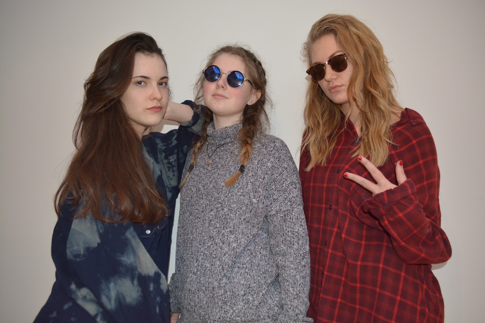
For the double page spread I used images from our photoshoots. I chose the image of the models sat on the sofa as the main image as I liked the simplicity of it. I think it really captured the indie rock genre and the essence of the band. For the main Masthead I continued the theme of using the Indie Summer font, this helps the magazine flow nicely. For the layout the pages I decided to place the main image across the two pages slightly. I used rule of thirds as this creates a flow from one page to another. I also added smaller images of the two models around the main image. I like this as it shows variety of shoots, poses, locations, outfits and positions. For the background, I used the colour drop tool on Pages to match the colour of the blue shirt one of the models was wearing. Then for the box's of text I used the colour drop tool to match the colour to the reddish tone of the sofa and the other models shirt. I think this creates a good composition and the colours not the page compliment each other. I again used Indie Summer for the subtitle of the interview. For the rest of the writing, I used Arial as this was the most picked font from my survey. I also used Arial for the captions on the images. I think by adding the captions of the images this creates a sense of professionalism, and also benefits the reader. I added another box which gave the reader some of the bands favourite things, I wrote this again in Indie Summer, which i think helps pull the page together. I also formatted the shape to an off-white which compliments most of the white typography and also the background of the images from the photoshoots. A con for this double page spread, could be that the typography of DECADE in the left corner. The colour of the masthead could be missed as it similar colour to the background. Another con could be the article is very spaced out and there isn't as much detail as other articles are.


Front Cover 2: For this front cover, I used one of the images from our first photoshoot. I cropped the image so that it would fit into the portrait size. This is because majority of magazines have portrait covers. I think this fits the genre of our magazine as it trendy and stylish, the white background gives the impression of a studio which makes it look more professional. For the masthead I used one our previous experiments for the logo for Indie Now. The typography is bold and eye-catching which stands out. I used black to back the white typography which helps it stand out. The cons of this front cover is that maybe a bit plain as there isn't many coverlines. Our inspiration is INDIE magazine and they tend to have very simplistic covers. However this could be a con of our magazine cover. Another con could be the typography for the coverlines across the right third. This could be seen as being too simple or too small of a font. I decided to use the font Indie Summer, as I think this fits the image and genre of our magazine. I decided to make the 'Decade' larger than the text under it, this makes the name of the band eye-catching and stand out. To edit the image I adjusted the contrast to be darker, this also created a more striking contrast between the background and the models. I then heightened the colour saturation as I liked the cover being bright and colourful. I added a barcode to the left bottom corner, this is because most magazines have their barcodes positioned there. I then added the issue number, price and date above it. This adds a professional image to the cover, for the typography I used Indie Summer as it corresponds with the main coverline. I think by having the bar code and the coverlid on different thirds of the magazine this creates a good and balanced composition.  I also added a slogan under the main Masthead, I think this works well as it gives the audience a little bit of information about what will be in the magazine. I again used Indie Summer for the typography as it works well overall within a composition.


Contents page: For my second contents page, I wanted it to correspond with the front cover. This creates a good flow through the magazine. A con of this contents page could be that there should be more writing and sections. Another con could be the images could be more scattered across the page. Another con could be the typography of the 'Contents Page' this could be bolder therefore it would stand out more. The Pros of this contents could include the colour scheme working well together. I decided to section up the articles in the magazine, for example: News, Style, Music. This helps the reader pick out which section they want to go to in the magazine. For each section I made the typography larger and used Indie Summer. I think this makes the magazine stylish and fits the image of our genre. For the text under the subheading, I used Arial. This is because it was the most picked font from our survey. I then added a box which I adjusted to the be the colour of the models red shirt in our main image. As this is our main article of the magazine, I decided to use images of that band primarily. For this image I edited it to be the same effect of the front cover: i adjusted the contrast to be darker and the colour saturation to be brighter. However I also used images of other artist, for example top right and middle right. Another Pro of this cover is that I have also used images of the band Decade from different shoots, this shows as variety in clothing and locations. The box being the same as her shirt, this creates a good composition for the contents page. I decided to make the background and off grey and this corresponded with the photoshoot shot in the bottom left. I then coloured the typography to be a darker grey, I think this works well and helps it stand out. I also made the typography of the page references to be bold, this helps it stand out and therefore will benefit the reader.

Front Cover: For this cover we used Adobe InDesign, as it had a wide range of templates of magazine layouts. This was useful as we able to pick a template which would fit the genre and image of our magazine. The Pros of this front cover is the Masthead is large and eye-catching. I also like the coverline under the masthead as it stands out against the background. I like the simplicity of the composition and the eye is drawn to the main image as the background is very plain. Another pro is we have included the website in the bottom right corner under the barcode which I like. Some Cons to this front cover could be that it is too simple. Some magazines are very busy with their front covers and this might be a disadvantage to our magazine. Another Con could be the image isn't edited much, images then to be edited a lot when it comes to a front cover. To create the masthead, we used Arial Black and this was a popular font choice from our survey. We decided to back the masthead with black under the white as it helps it stand out. We also included the issue number and price under the masthead, which I think is beneficial to the reader. I think this fits the image and genre of our magazine as it simple and trendy. Overall it would appeal to the younger generation, however is it simple which would also appeal to the older generation. To improve this cover we could have incorporated more colour, or used the Indie Summer font as it fits really well with our genre of magazine.

Contents Page: For this contents page we used Adobe InDesign again, this again is because it gave us a range of templates for magazines. A Pro for this contents page is the way we have split the articles into sections. I like how it a simple but effective contents page. I think another Pro is the main article of the magazine is highlighted at the top. This is shown through the images of the band. I think the composition works well as the colours of the fonts used compliments the colours of the images. I also like how the page references have been put onto the images of the articles. A Con of this contents page could be that the font of the masthead might not flow well with the rest of the magazine. However I like there is a variation between the boldness of the typography. Another con of the contents page could be more images may be needed down the left side of the page. The space under the two smaller images looks quite bare. Another con could be the overall composition is too simple. To improve the contents page we could experiment with larger typography and fonts. Overall I like the composition of the contents page as it simple and the colours used compliment each other nicely. I also really like how the page references is put in bold and italics. This benefits the reader and helps them stand out. To improve also we could try experimenting with editing the images also. I think the layout works really well and I will think about using this layout and design for my final draft.

Double Page Spread:  For this double page spread we used Adobe InDeisgn as it gave us the templates for a magazine. For this double page spread we used a main image to cover the majority of the space. A Pro of this double page spread is that there is a large focus on the main image of the band. Another pro is the masthead, I really like the typography and the strikethrough. A pro of this cover is that there is  a large amount of text for the interview therefore it isn't just filled up with pictures. A con of the double page spread could be that it could be seen as too dark. Another con could be that the page looks too simple. Another con could be the transparency of the three images on the right corner of the page. Overall I think the double page spread fits the genre of our magazine. I think its stylish and artistic and would appeal to Indie Rock lovers. To improve this double page spread we could lighten up the page slightly and make it more vibrant as this could mean it would be more eye-catching. I think it would appeal to the younger and older generations of our audience, however majority it would appeal to the younger generation. I think the composition and layout works well as the main image of the girls isn't covered but there is a still a lot of wiring and the interview is covered.

Tuesday 1 March 2016

Photoshoot Development- Final Chosen Images


 I've chosen the best for our magazine, these haven't been edited yet so they will be edited before putting into our magazine. We decided to carry out a second photoshoot as we wanted to show a diversity in outfits, locations and positioning. Our second photoshoot we did again in a studio however we changed the make up and clothing, this shows the diversity in fashion and outfit choices. For another idea for a shoot, we decided to go outside for some photos. This would show a diversity in locations and backgrounds. The weather was quite dark and


dreary which was one of the disadvantages of taking photos outside. However it added a grunge effect to the photos which was what we wanted. We also decided to take some photos in the style of INDIE magazine as their front covers really interested us. We used natural lighting and the sunglasses to get the reflection onto them. The photos came out quite well, I like the ones of the models walking as it shows them just in the moment. I like the photos that are simple but also are edgy and fun.
These next images are from the development shoots, whereas the first two images are from our first shoot. We wanted to take some more pictures to use in our magazine for variety. I really like the new images as well as the old ones, and I will be using both in the magazine front page, contents and double-page spread. For the images which were taken outside, when editing I will try to edit the exposure as the lighting is quite bright on the photos. I would like them to be slightly darker.
We will experiment when designing our front covers with different images. I think the images taken in front of a white backdrop will work well as it will look professional. However I think the the image of the single model in the woods would work well as it would stylish and artistic. Either of the images will fit the genre of our magazine therefore will make a decision of which to go with. We will also be using all the images throughout our contents page and double page spread.

I think the top image will fit our genre as it simple and casual. I think when editing this image I will considering changing the saturation to black and white as I think it has a edgy and cool mood to it. This image would work really well for the contents page or a smaller image on the double page spread. The bottom will be really good for our front cover as it interesting and eye-catching. I think the blue composition works really well.